

When I first joined the small team, we already had a bold and highly stylized brand that worked beautifully for voice and marketing. However, that expressive language didn’t translate well into the product experience, as there was no clear design system in place to bridge brand and interface. At the time, the team was also working in Adobe XD, which made collaboration with developers less efficient due to its limited handoff and version control capabilities. To improve both workflow and design quality, I proposed transitioning to Figma while simultaneously building a component library to serve as the foundation of a scalable design system.

Through an initial audit of our existing products, several key issues surfaced:
I set out to establish a sustainable design system that would bring visual and interaction consistency across products, streamline collaboration, and reduce technical debt through clear documentation, scalable components, and a single source of truth for design decisions.
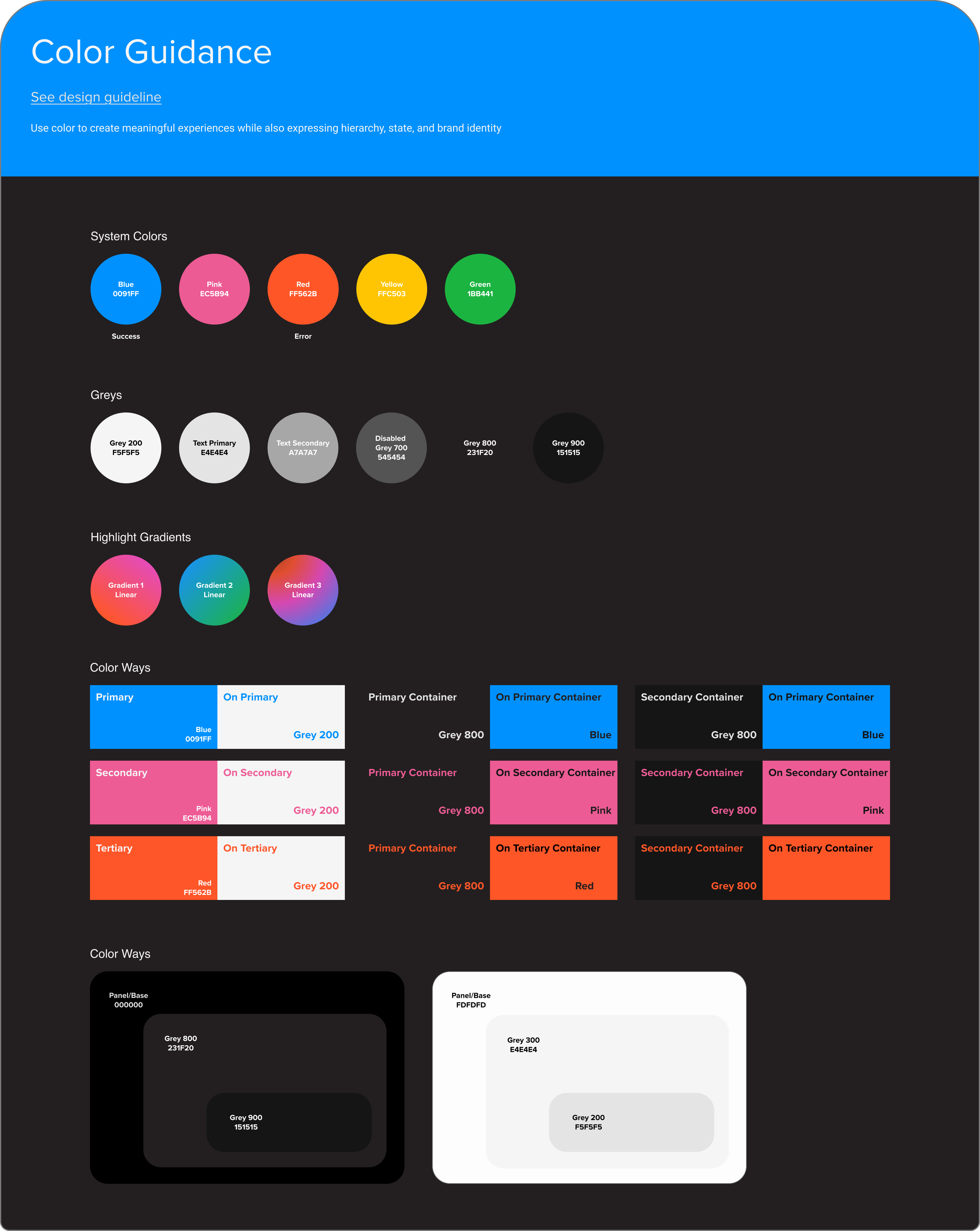
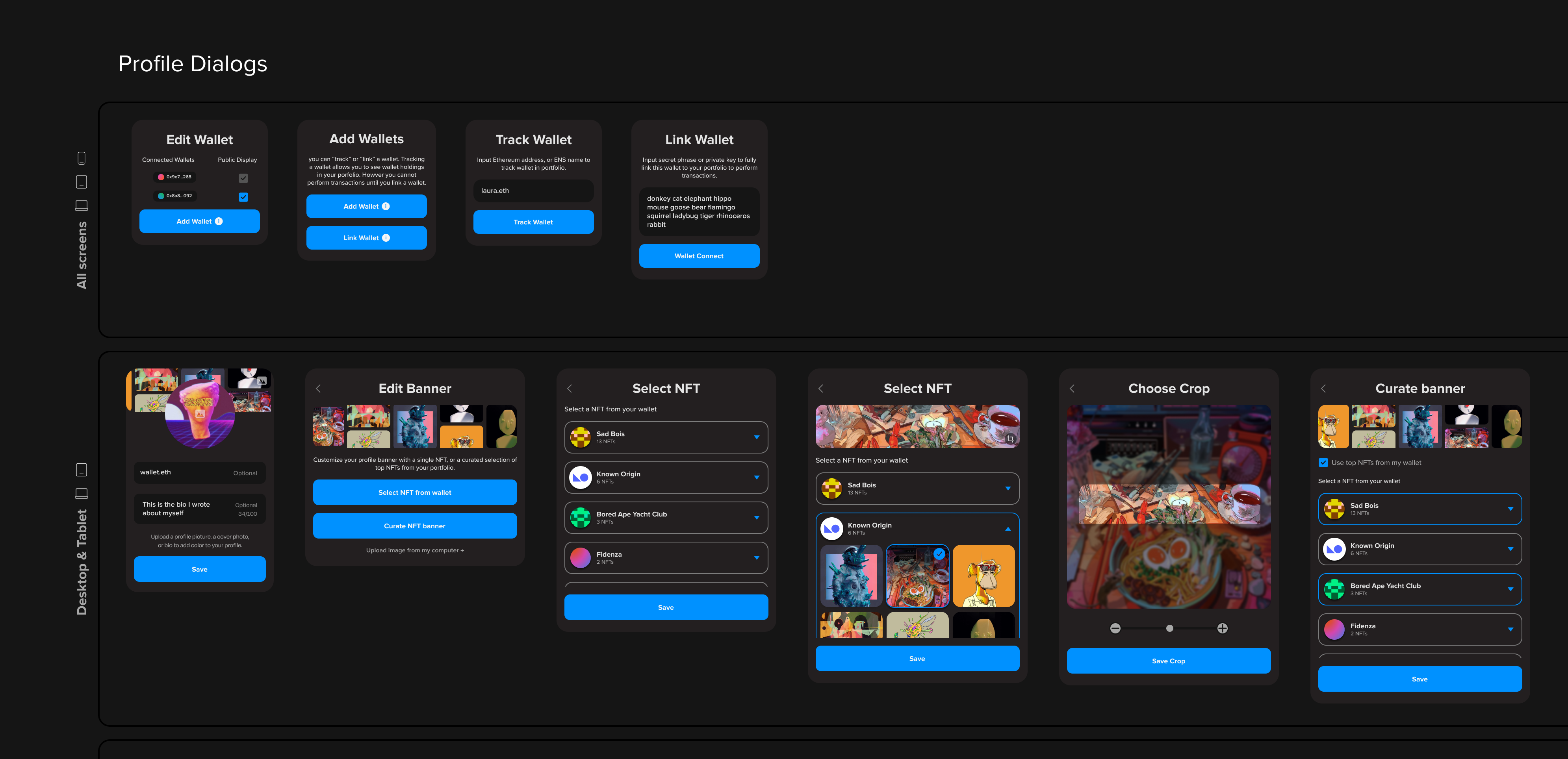
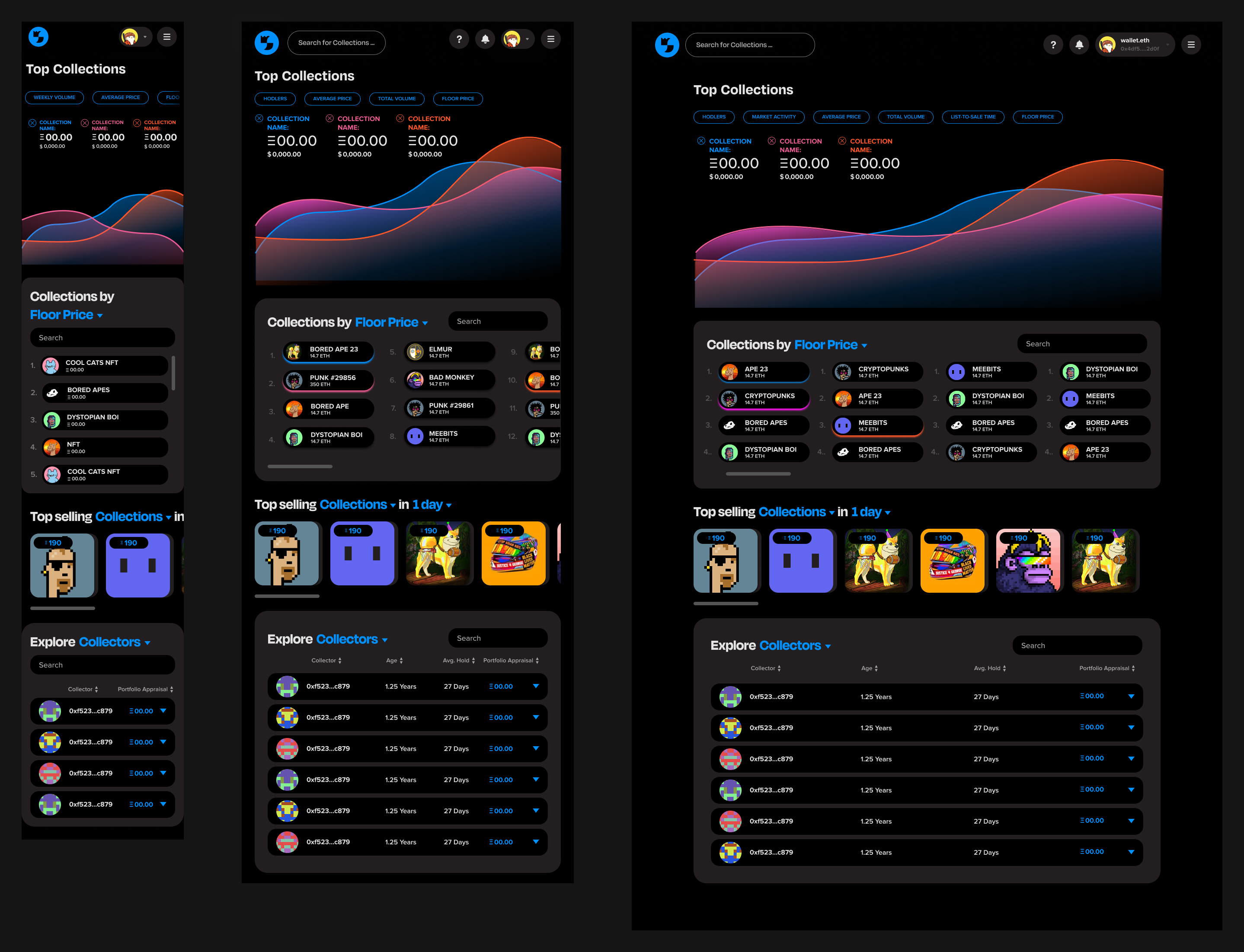
I started from the ground up, working with our art director to develop the basic style kit. I defined the values of our core design elements—colors, typography, spacing, and elevation. These foundational elements, served as the building blocks once we moved on to more complex components.
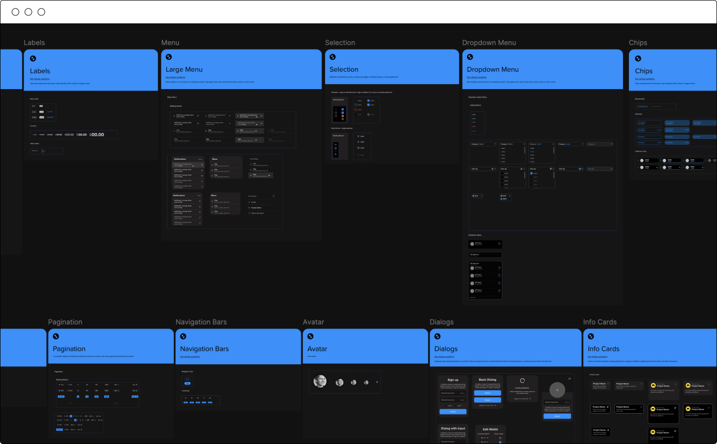
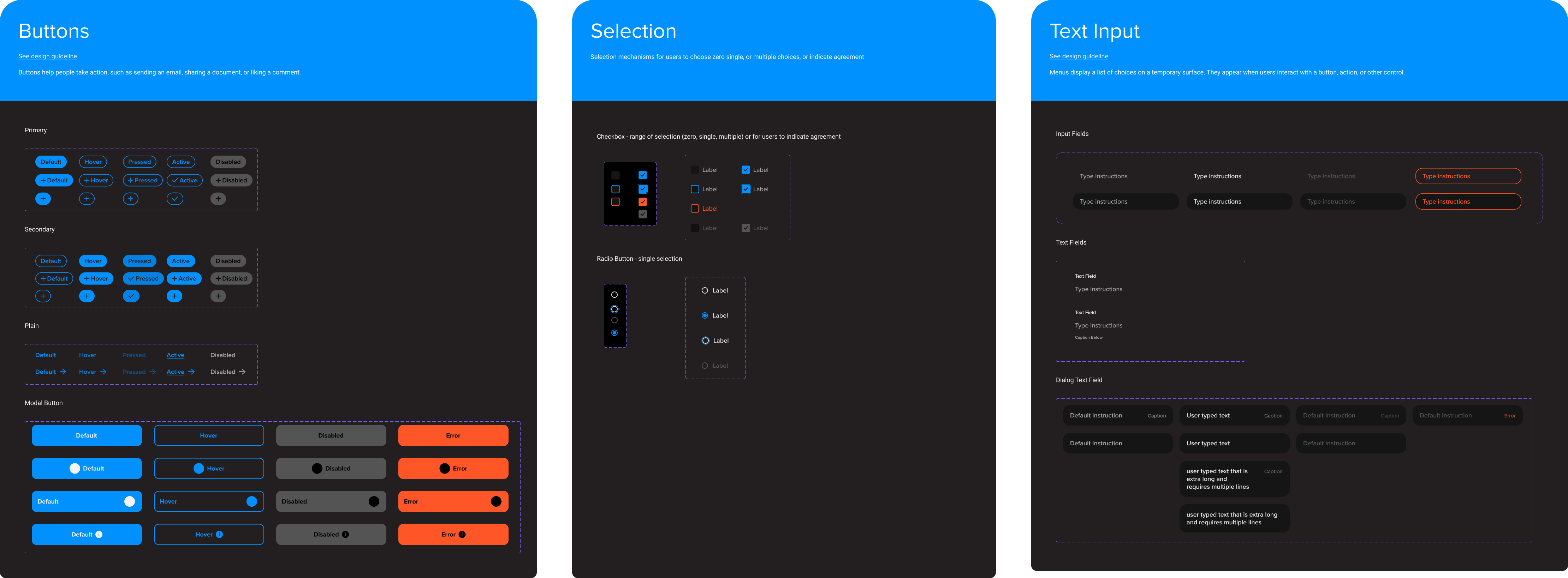
I began building our library of reusable components, each designed to be flexible, accessible, and responsive, with defined variants and interaction states. To ensure the system could scale and remain consistent, every component was documented in Figma with usage guidelines and notes on behavior and constraints. The documentation served as both a design reference and a bridge to development.
Using the core components, I began combining them into patterns of consistent interaction logic and visual rhythm across the product. These patterns served as starting points for full screens and flows. This approach not only accelerated design and development but also ensured a cohesive user experience throughout the product. By reusing established patterns, the team could focus more on solving user problems rather than redrawing interface elements.

The new design system quickly became a core part of our workflow. The component library allowed the design team to iterate faster, even when working with complex UI styling — freeing us to focus less on visual details and more on user experience. The handoff and integration process also demonstrated how effectively the system bridged the gap between design and development. Reusable components significantly reduced frontend build time, while shared tokens and variables ensured visual consistency and scalability across the platform.
Because of our small team size, we kept documentation lightweight — prioritizing adaptability over formality. Through this process, I came to see how essential collaboration between design and code truly is. Building a design system isn’t just about creating Figma components — it’s about aligning how designers and developers think and make decisions together.
Maintaining a design system is also an ongoing effort. With constant product updates and evolving needs, keeping everything in sync requires continuous attention and communication across the team — well beyond the initial setup.
Transitioning the team to Figma with a clear, scalable design system ultimately improved our workflows across both design and development. More importantly, it taught me that success in system-building comes down to a balance of hard conventions and soft collaboration skills.