
The opportunity for design emerged from the high barrier to entry within crypto. Most chains and products were built by developers, for developers — leaving everyday users to navigate dense interfaces, unfamiliar terminology, and opaque interactions. For anyone new to the space, even the simple act of reading or understanding a transaction came with a steep learning curve and a sense of uncertainty.
Existing blockchain transaction interfaces — data-heavy and confusing for those unfamiliar with crypto.
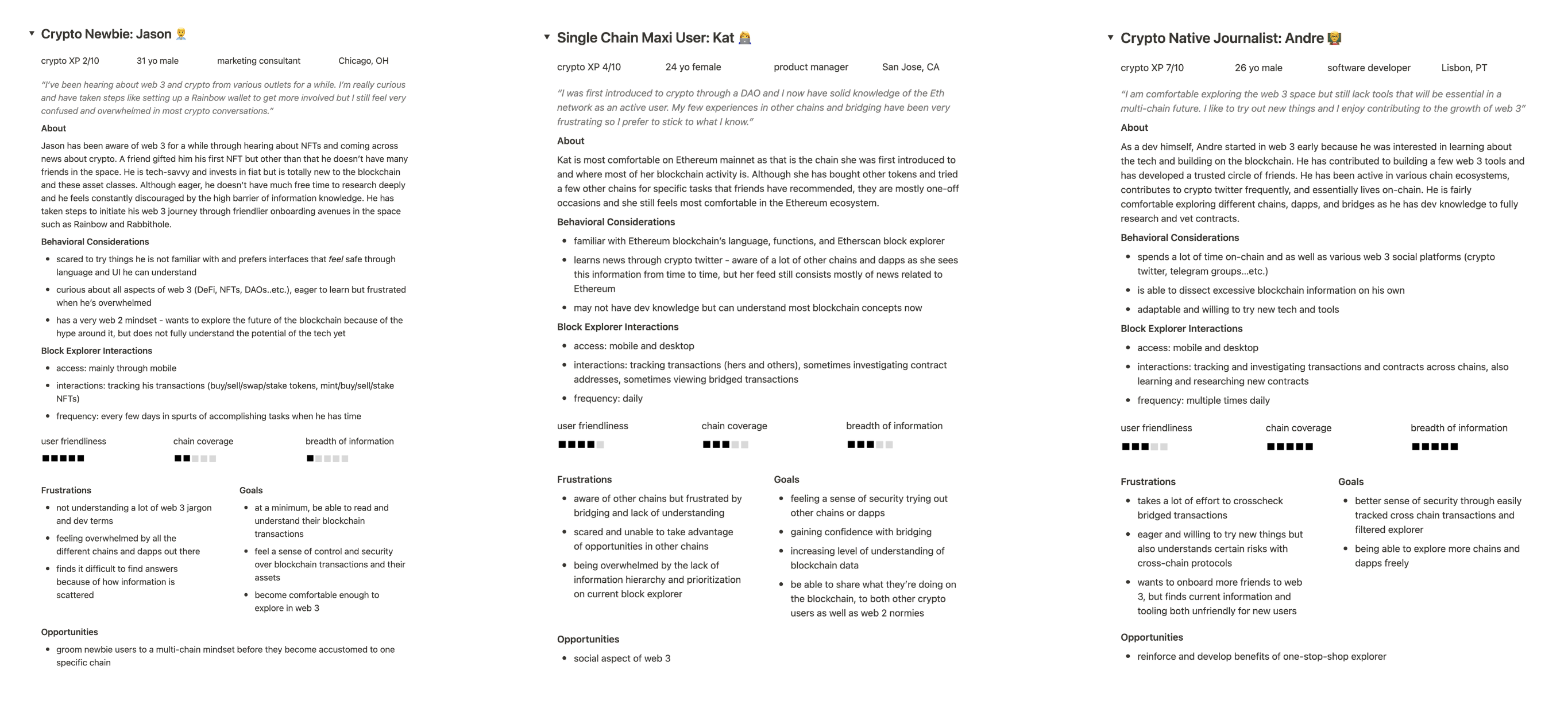
In a startup environment, goals and metrics shift quickly — but there’s always a north star guiding the product’s direction. To ground our design decisions, I conducted interviews with seasoned crypto users, chain entities, dApp developers, on-chain collectors, and newcomers to the space. From these conversations, we developed user archetypes to clarify who we were building for and what their core needs were.
We approached laying our foundation with care — because when it comes to people’s assets, security and trust are non-negotiable. Our goal was to position Dora as a neutral source of truth — transparent, reliable, and easy to understand for all types of users. Regardless of experience level, checking the chain is something everyone must participate in to exist on the blockchain.
User archetypes across blockchain experience levels
Based on user needs, our product centers on 3 core layers:
Explore — a clean foundation for understanding the chain
Search — intuitive tools for finding and navigating data
Act — clear entry points for users to interact with the chain

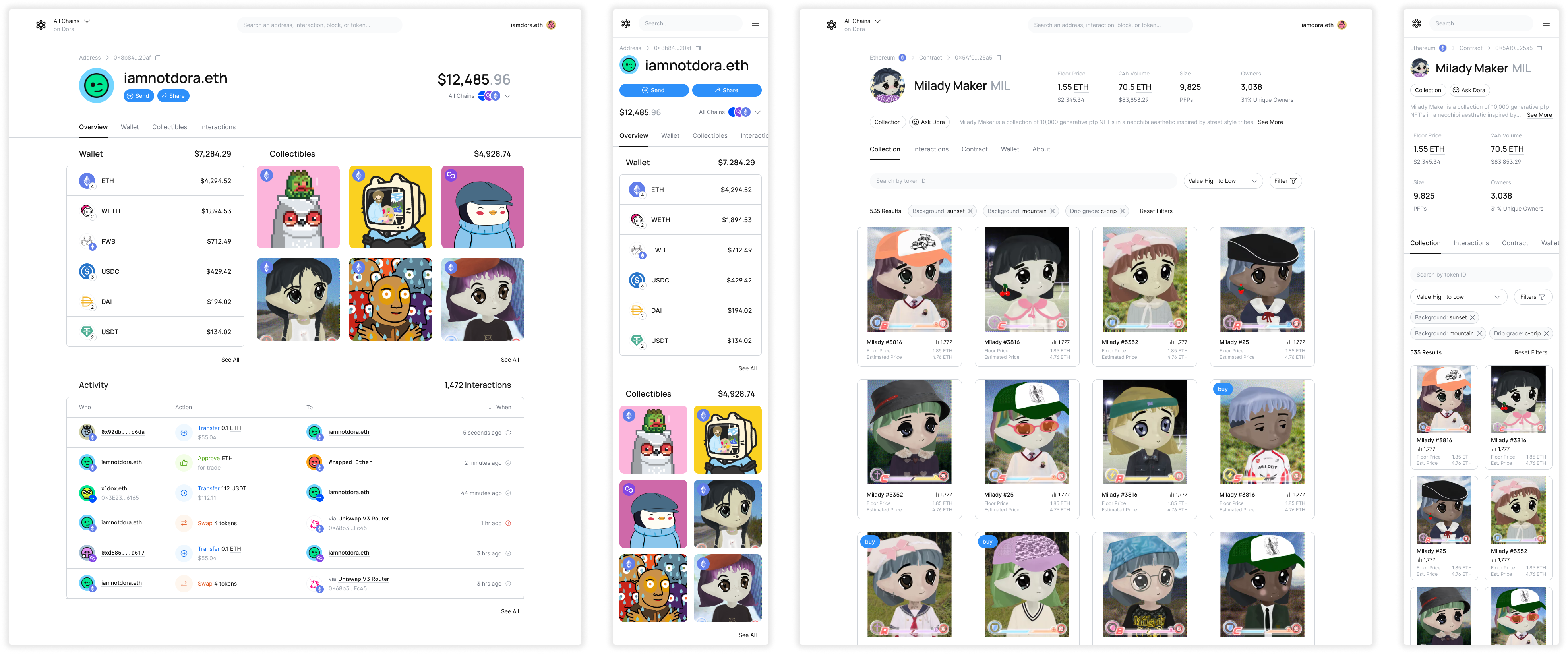
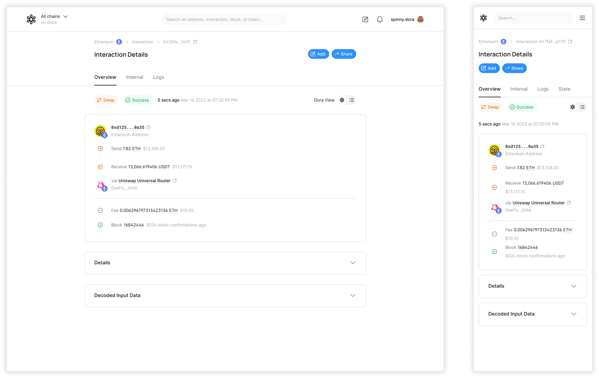
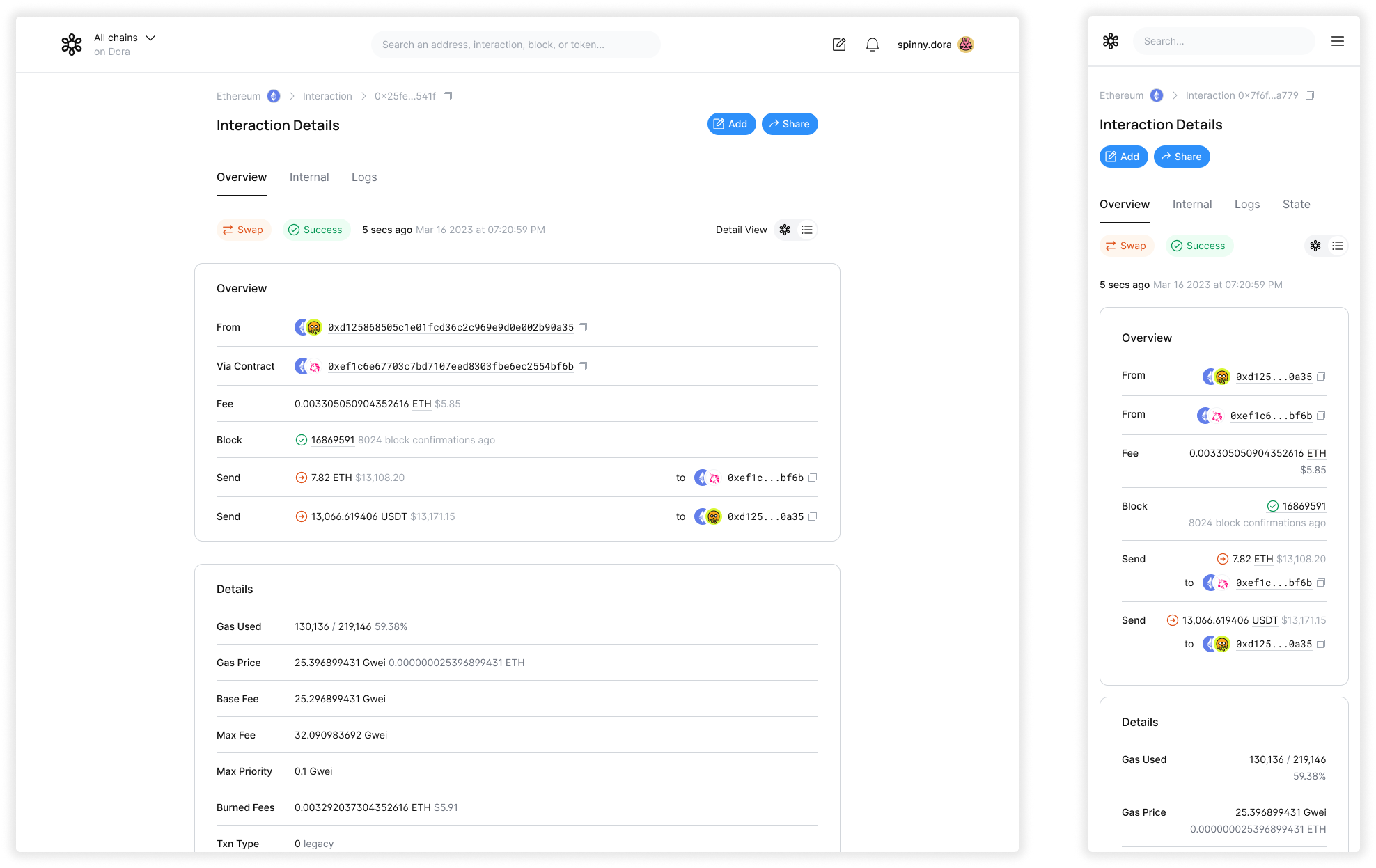
Our first product priority was to humanize the blockchain through accessible design. In this phase, we devoted significant effort to researching user needs against existing interaction patterns, studying how different audiences made sense of blockchain information (or struggled to). We dissected the structure of a single transaction — every data point, label, and relationship — to understand what mattered most to different user types.
From there, our goal was to define the most essential and human-readable interpretation of a transaction. We explored how to strip away unnecessary complexity while preserving clarity and trustworthiness, so users could intuitively grasp what was happening behind each on-chain action.
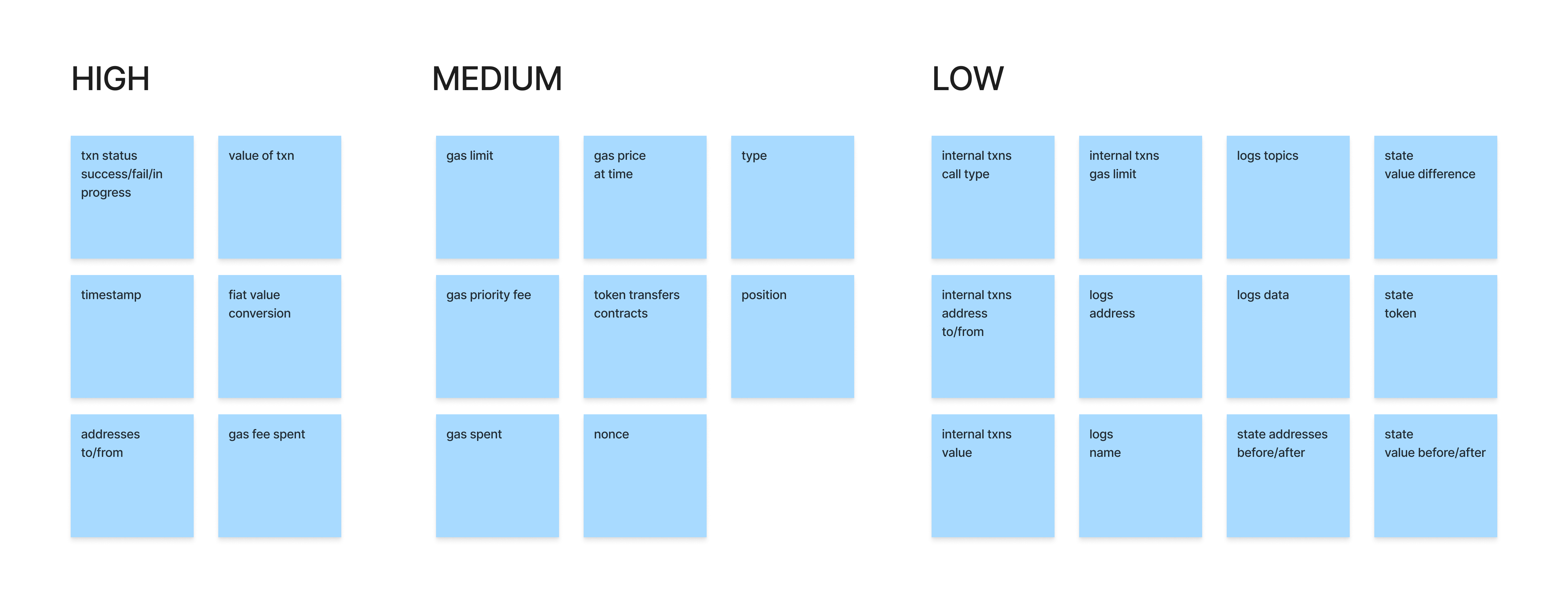
Components of a single transaction, and how they can be sorted in terms of hierarchy
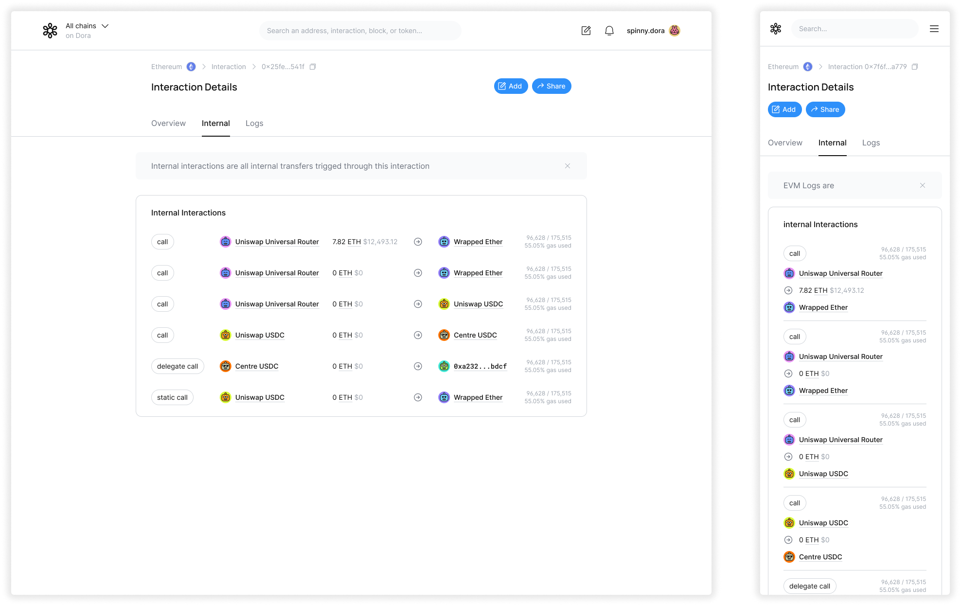
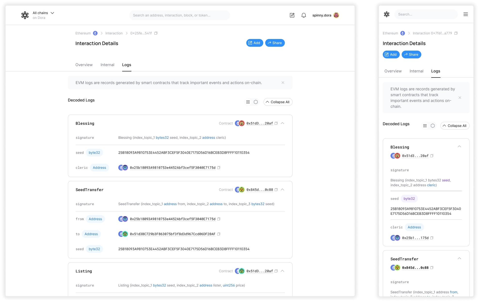
Through multiple iterations, we developed key solution elements that made understanding transactions more approachable and intuitive. From there, we established a clear information hierarchy to guide users through each transaction with progressive layers of detail. To ensure the system could scale, we audited and mapped a wide range of transaction types, identifying common structures and edge cases. These insights informed flexible design patterns that could adapt to different data scenarios — creating a cohesive, frictionless reading experience across on-chain actions.
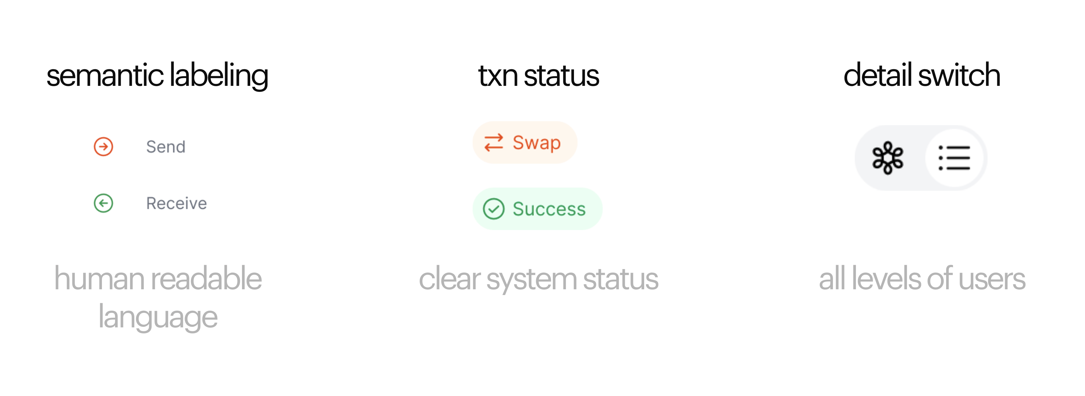
Key UI elements that improve the readability and comprehension of blockchain transactions
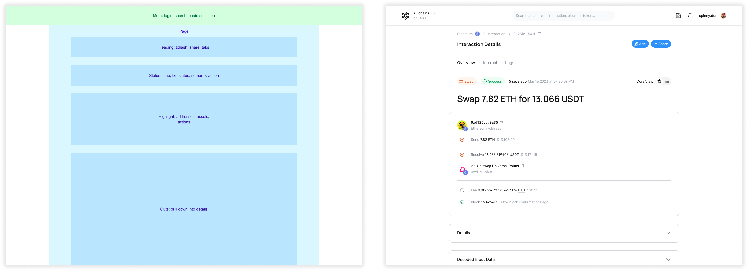
Negotiating information real estate in transaction display
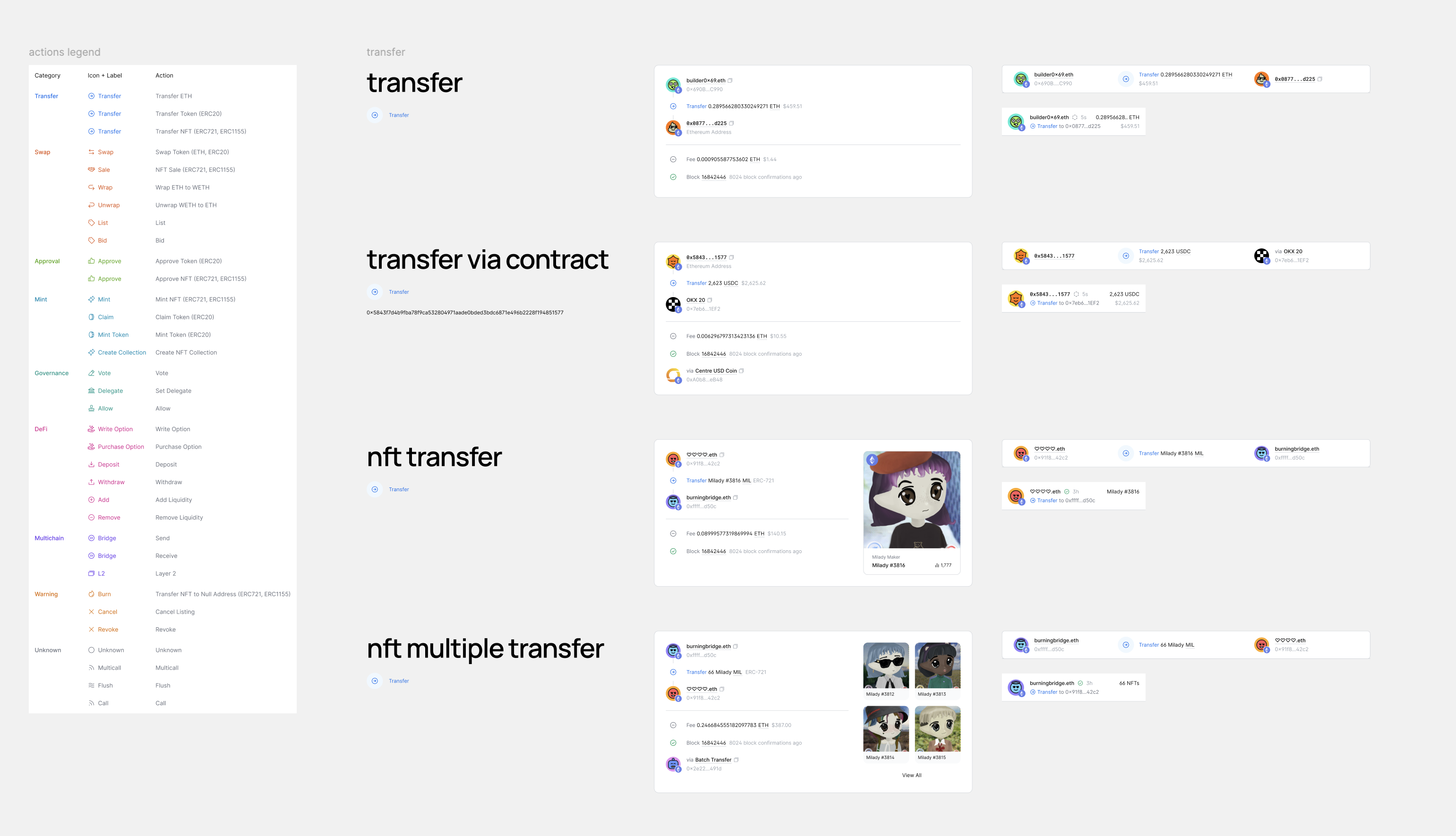
Snippet of designing transaction highlight sections for all types of blockchain actions
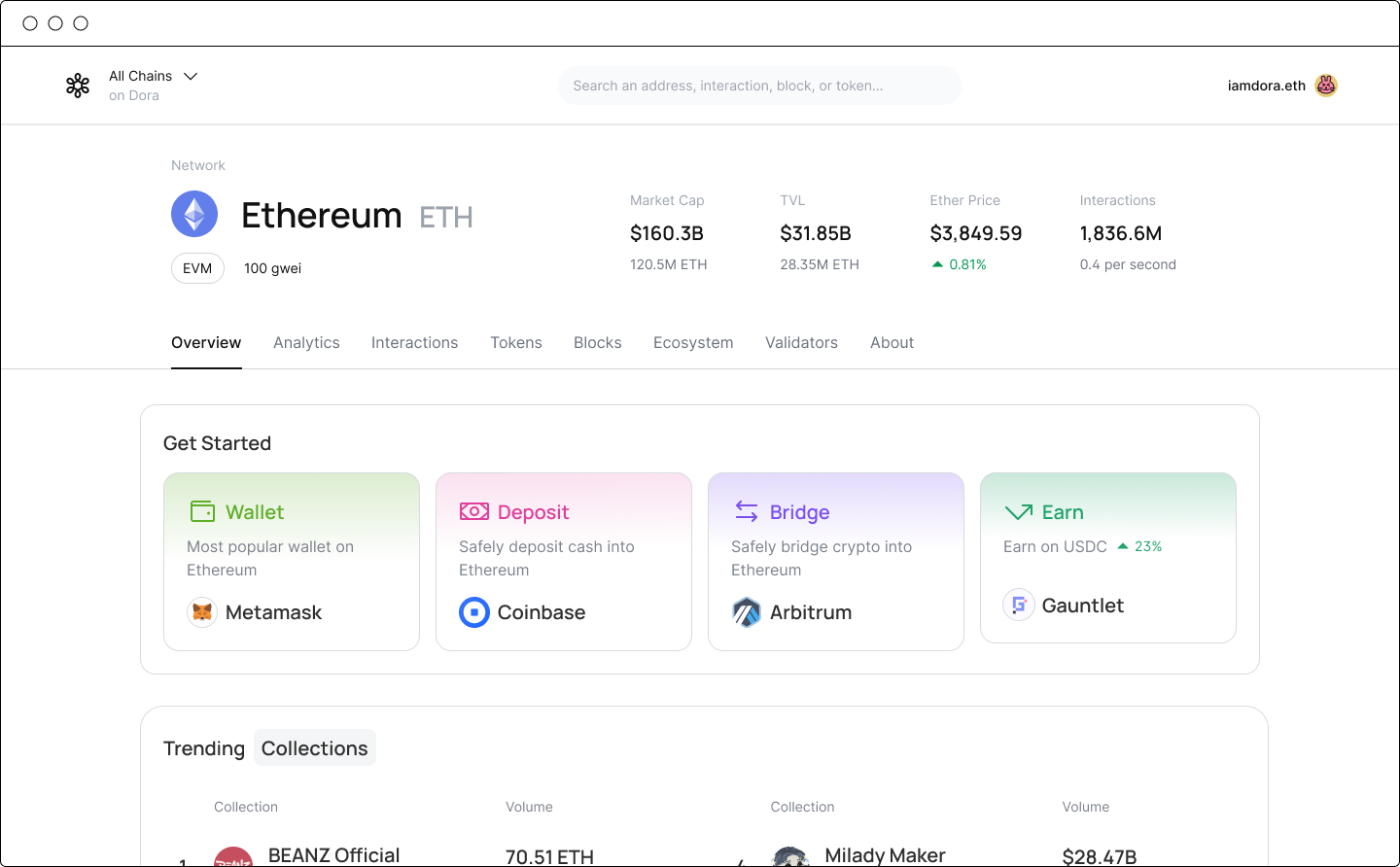
Beyond improving existing solutions, Dora was also one of the first multi-chain block explorers on the market. Typically, users viewing a bridged transaction would need to consult separate explorers for each chain. We organized these transactions so that all relevant information could be accessed from a single source. The design highlighted the most critical details for quick comprehension while still retaining all underlying data — surfacing everything users need, without losing anything they might want.
Although this phase of the product was ultimately not built due to other priorities, it represented an exciting and promising approach to simplifying complex on-chain activities, making them far more accessible.
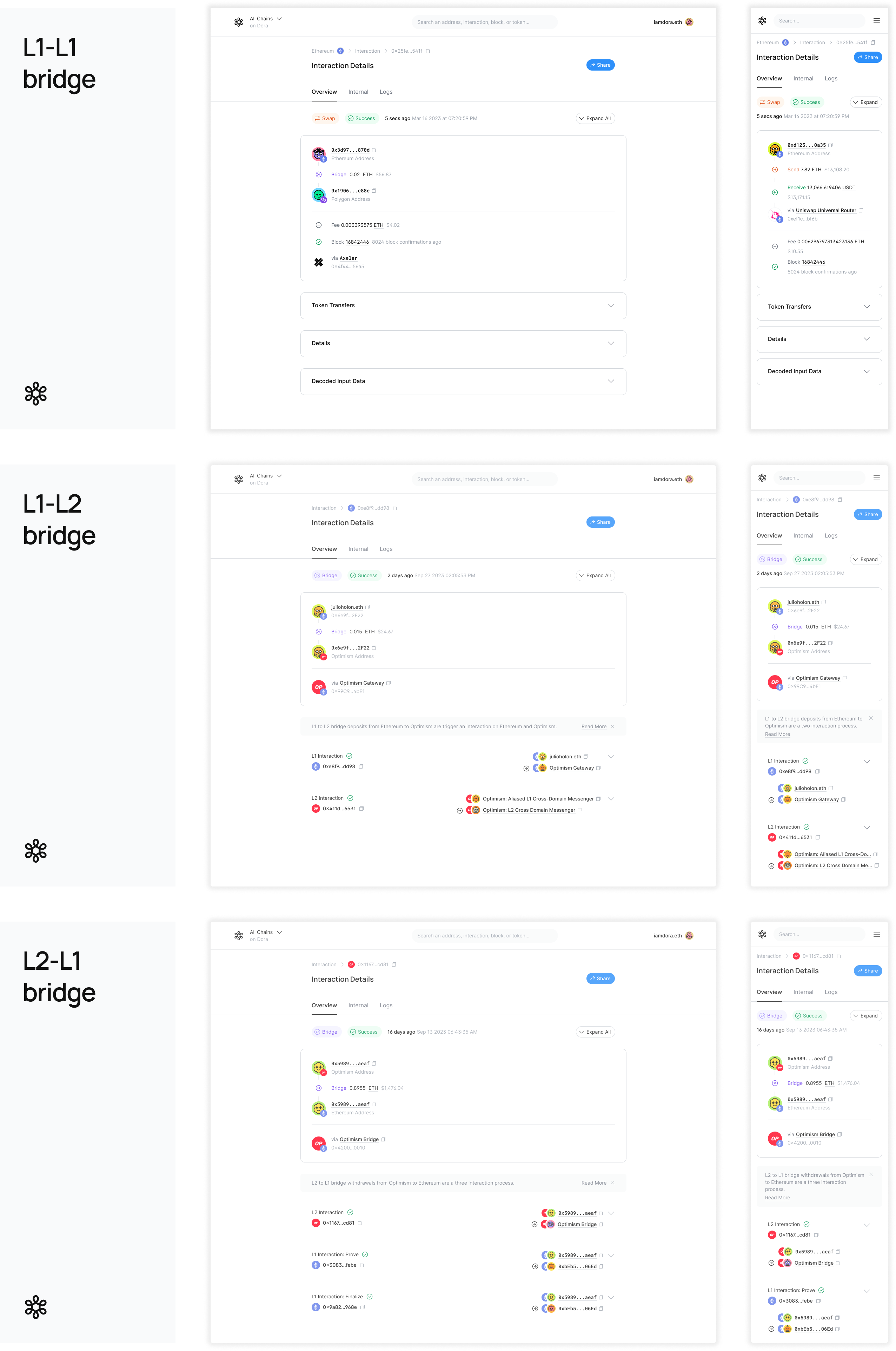
Different configurations of vastly different bridging actions across blockchain layers
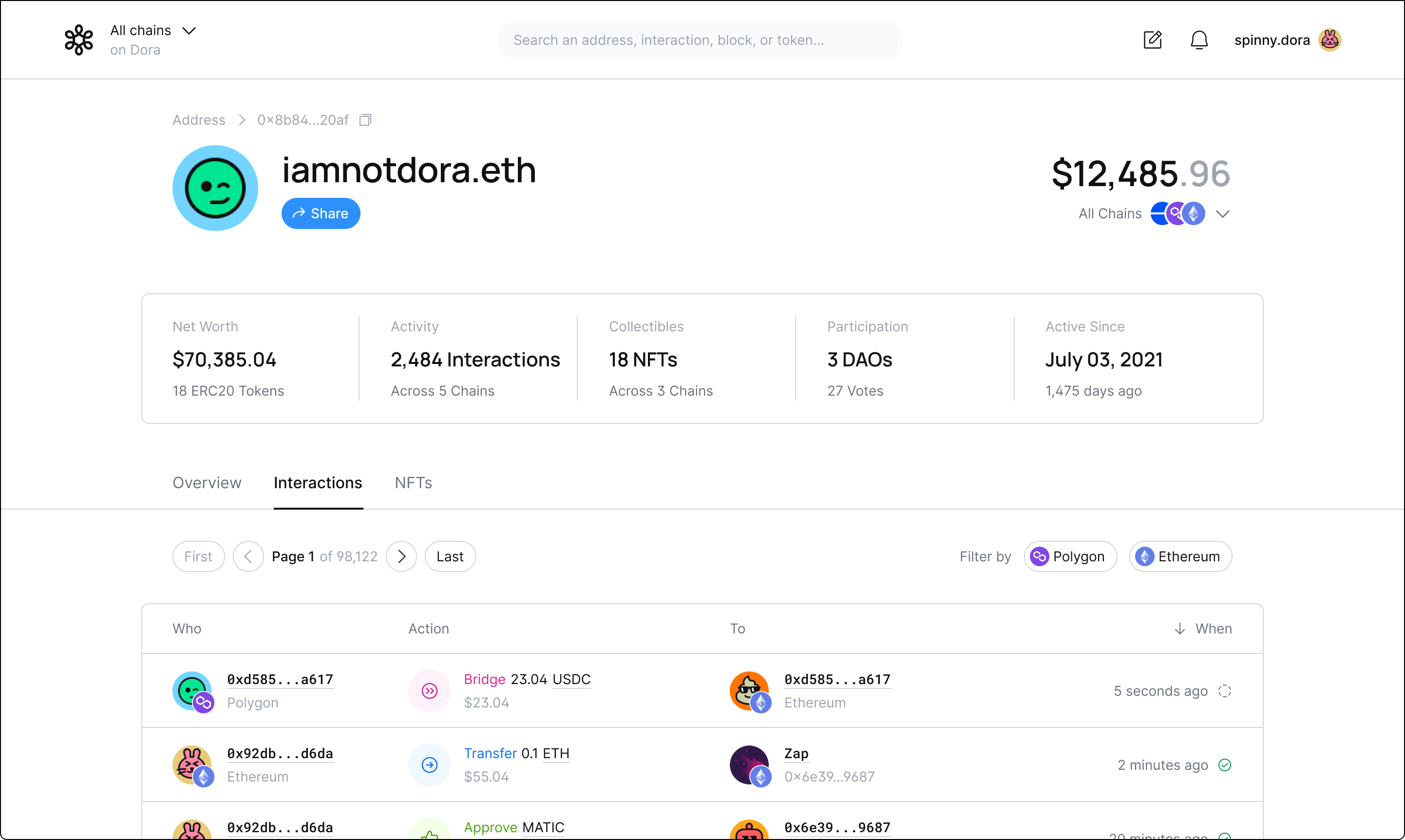
Arguably the most important function of a block explorer, this layer of accessibility allowed users to explore the blockchain in a more efficient and intuitive way. This project went far beyond simple UI design: the resulting transaction detail pages were shaped by extensive user feedback and careful consideration of different user types. As the design team’s first major project at the company’s inception, it was particularly meaningful to create transaction experiences that felt human-centered in a landscape dominated by developer-focused tools. We applied these same principles to designing other areas of chain understanding and discovery.
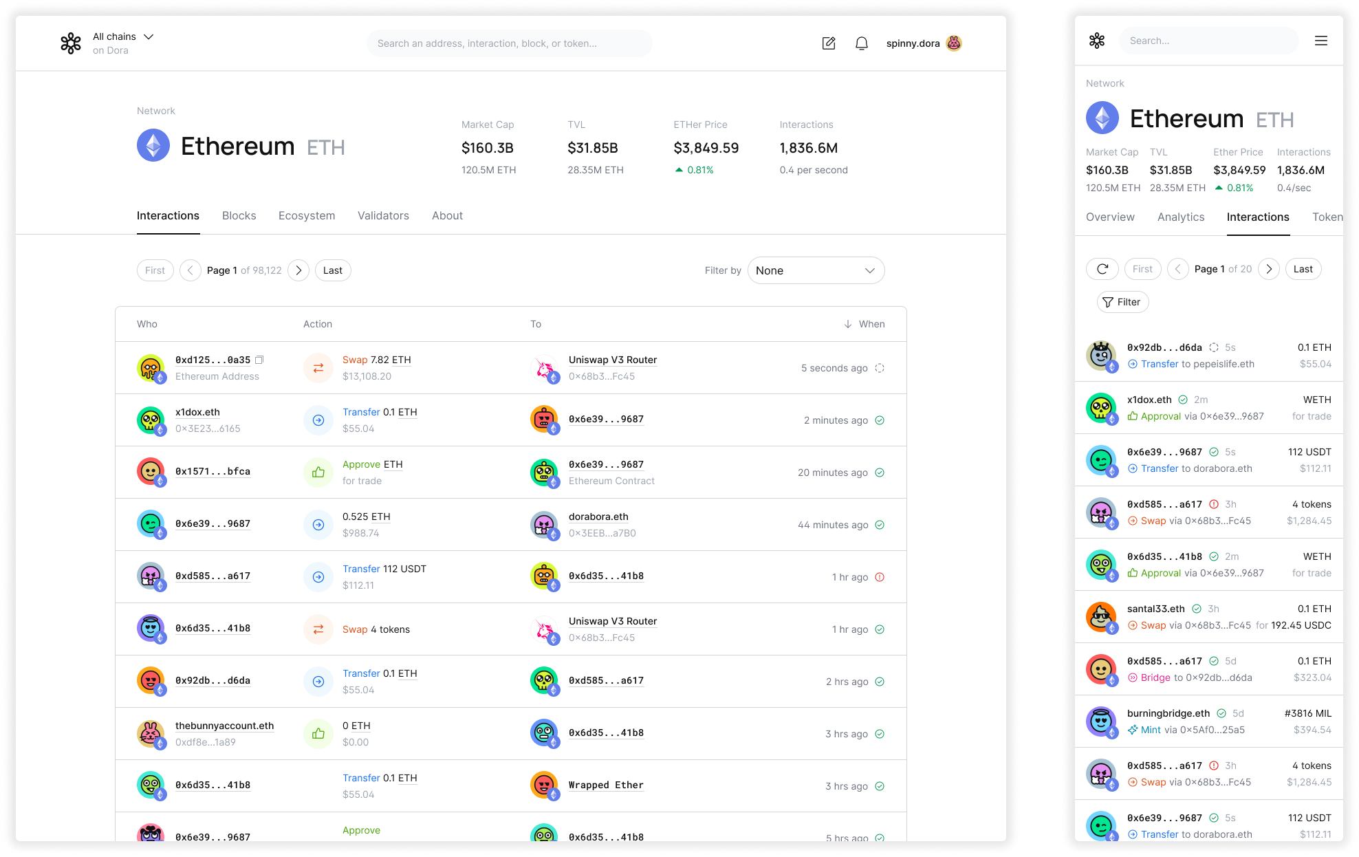
Browsing transactions on a chain
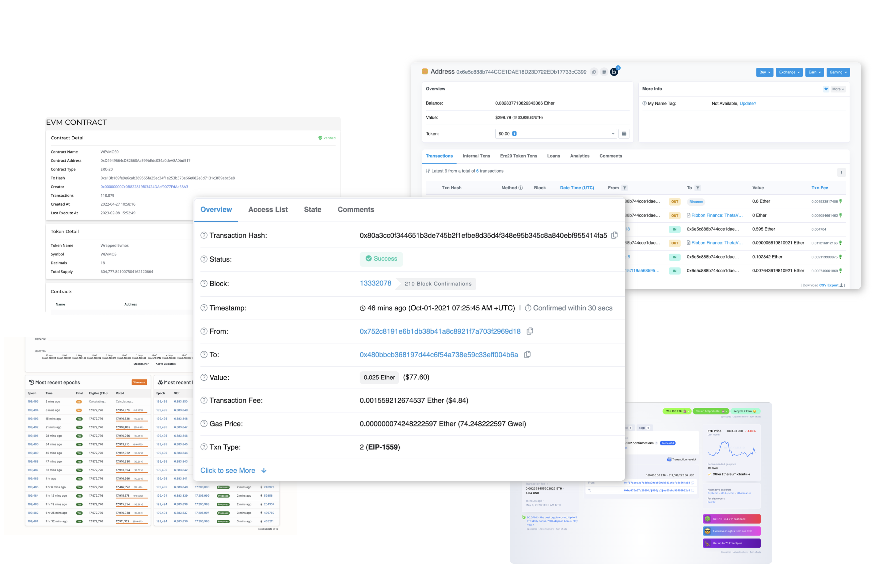
Search is a critical entry point for users exploring complex blockchain data and feeling confident navigating the chain. We observed how limiting the search functions in existing explorers were — often allowing searches only by transaction hashes, which required users to already know exactly what they were looking for.
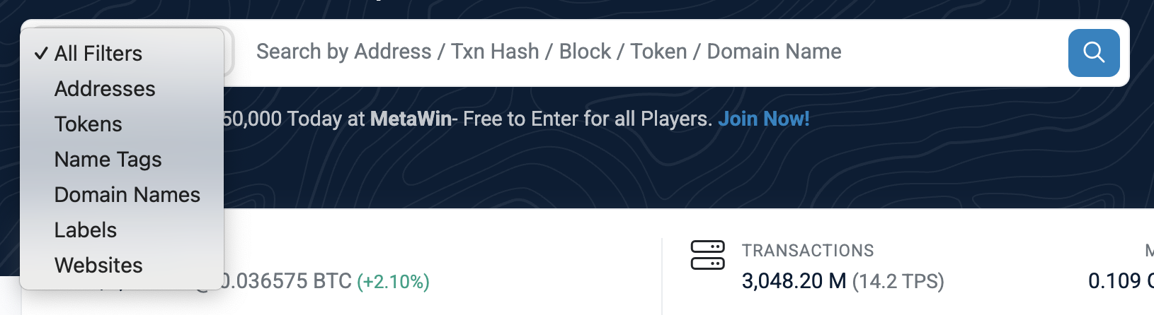
Examples of existing block explorer search tools — limited in scope and discouraging to explore
Behind every searchable query lies a goal or need that drives the user to explore the data. While many other explorers surface the same information, they often fail to design an experience that encourages exploration or makes search intuitive. I took a design-first approach by prioritizing a clean and minimal UI, familiar interaction patterns, and reusable components. This allowed users to engage with search confidently, whether they were verifying a transaction, exploring a token, or investigating an on-chain event.


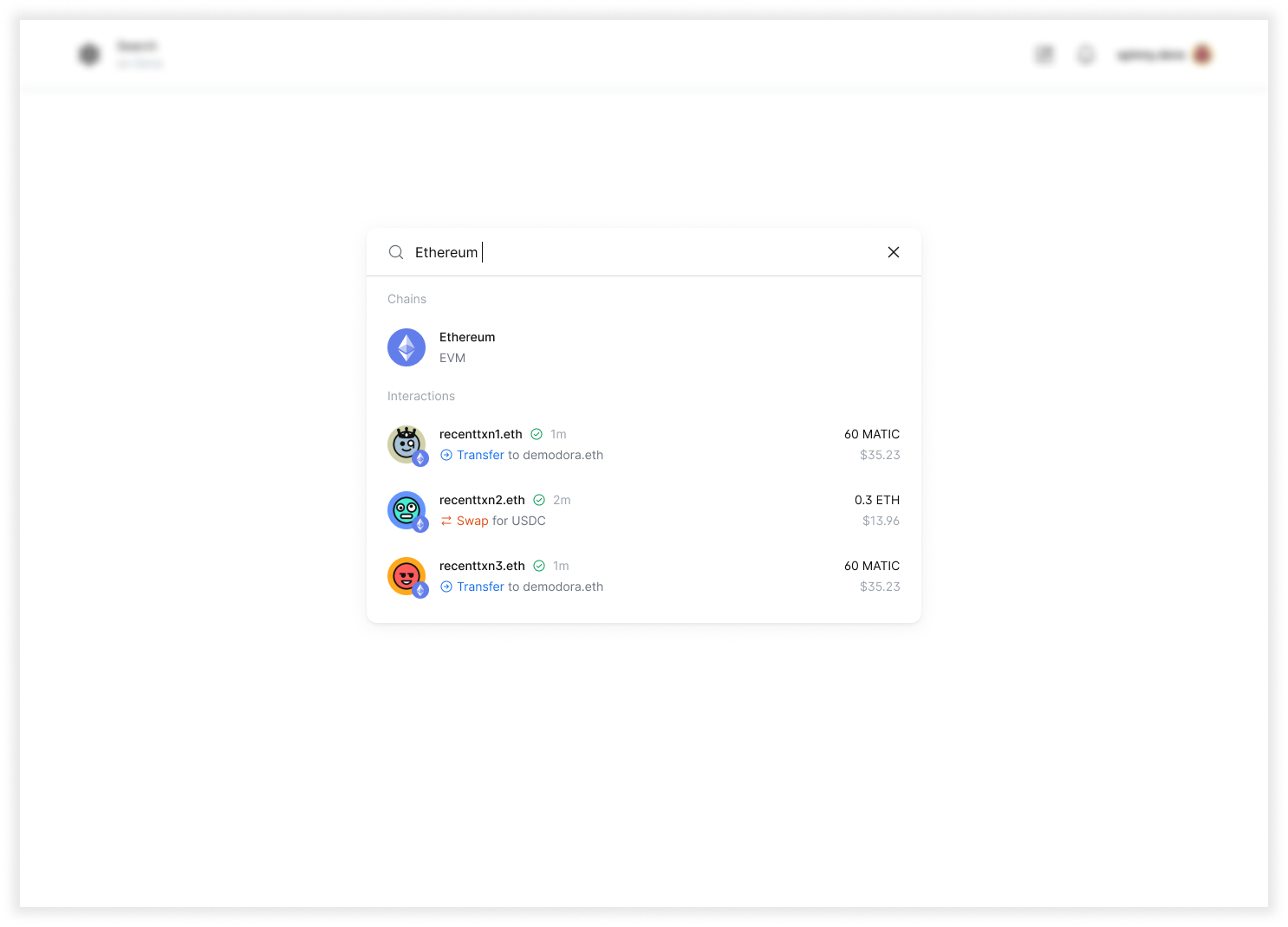
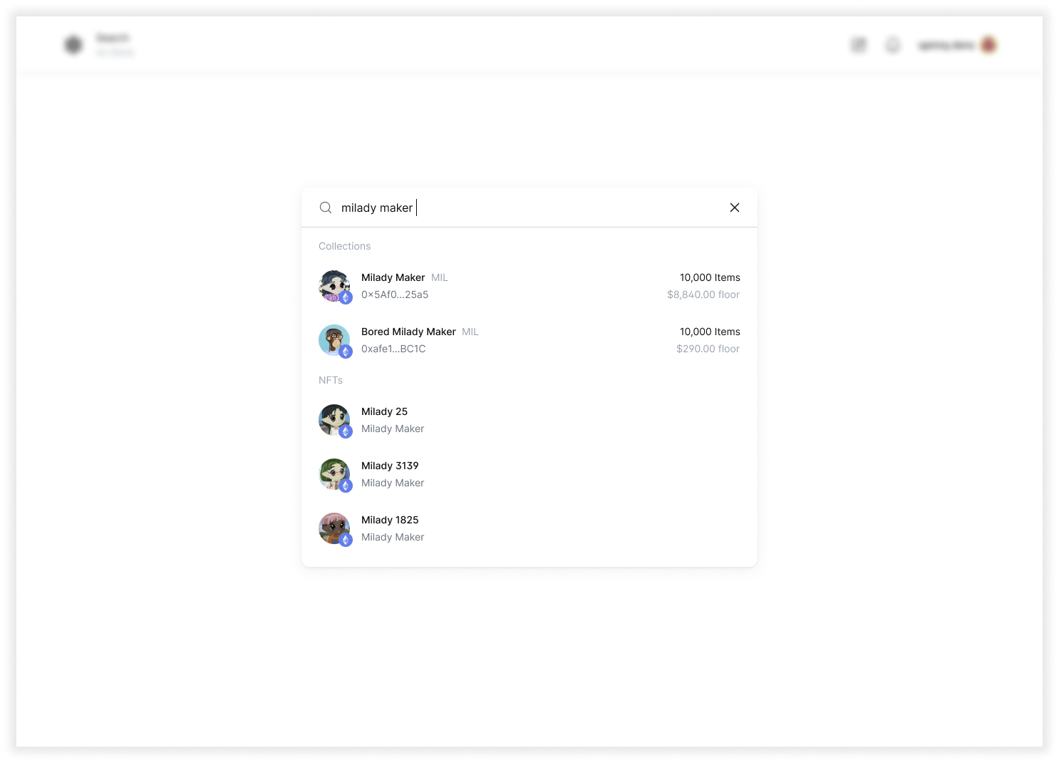
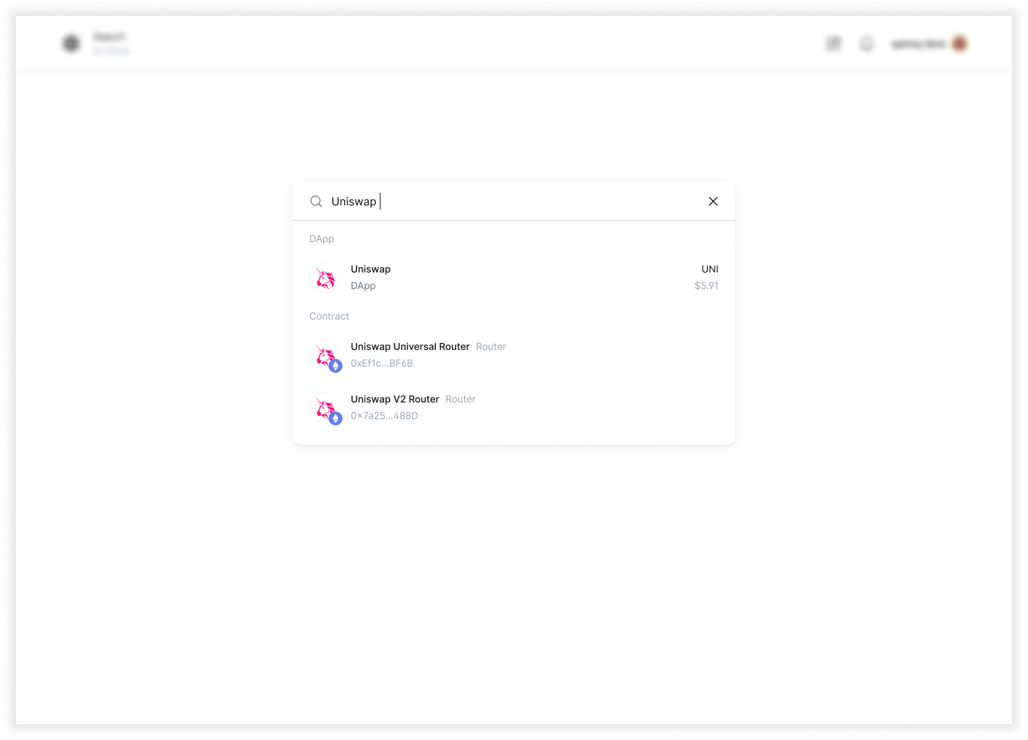
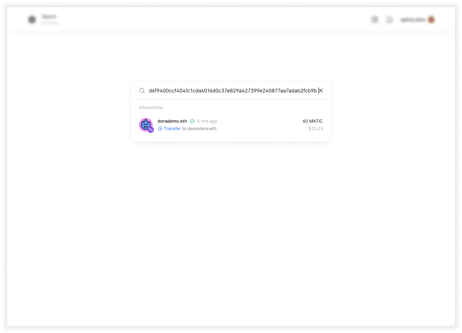
Easy access to search bar that covers different on-chain elements and more specific transaction filtering

The search bar provides quick access to common queries, while an advanced guided filtering system allows users to dive deeper into transactions. This guided approach supports users through the search process, encouraging more organic exploration and adding an additional layer of interaction with the blockchain. Beyond simply making the blockchain readable, Dora’s search capabilities transformed the product into a true blockchain search engine — enabling users to quickly find, filter, and understand.
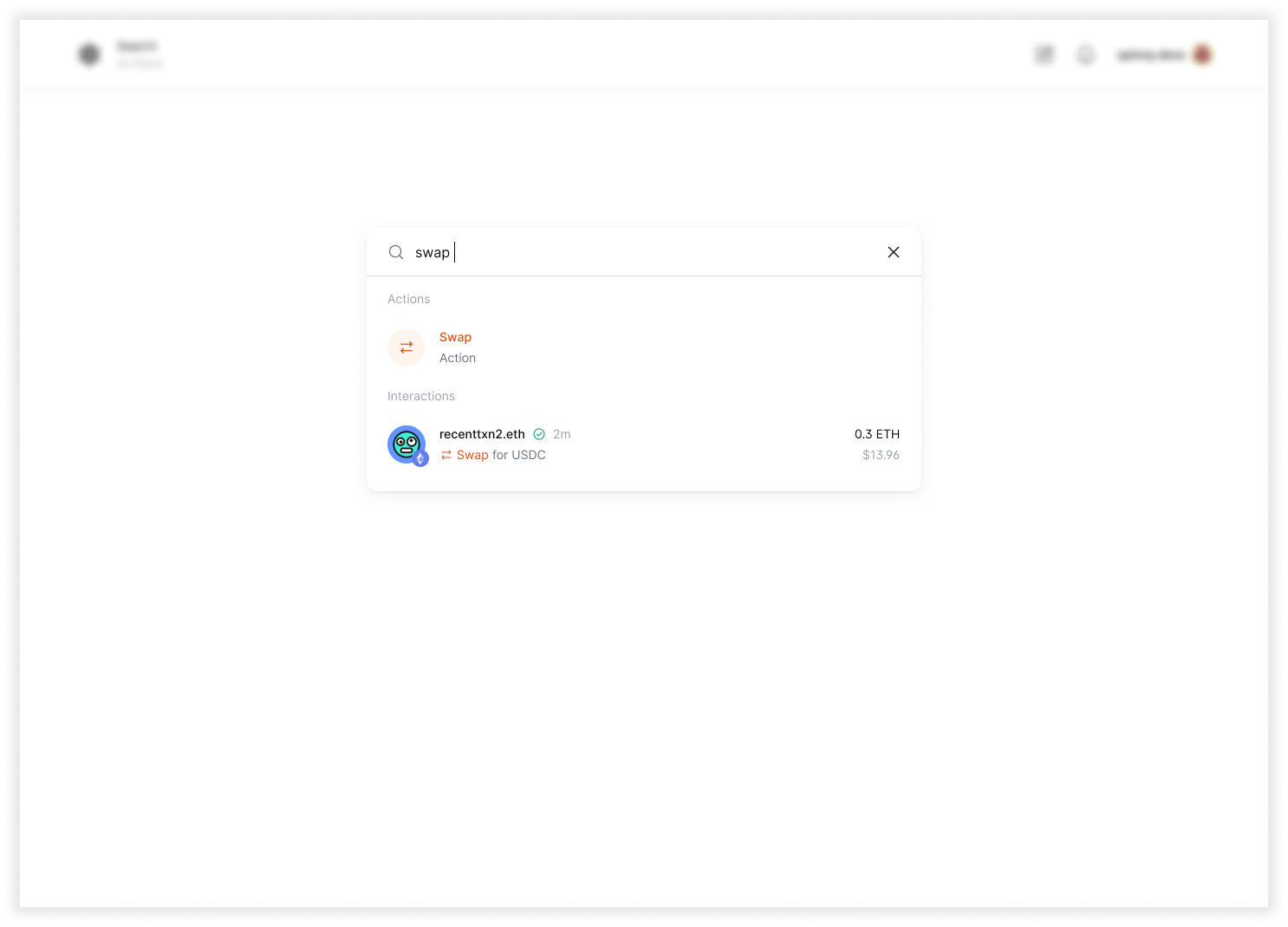
Once users could explore and understand on-chain activity, the next opportunity was helping them take meaningful actions. Users wanted clarity around the steps, outcomes, and risks of common actions like swaps, bridges, and mints. Understanding these pain points guided our approach to designing tools that lowered friction and encouraged engagement.

To support users in taking action across the product, I designed an action widget — a modular interface that brings core on-chain operations into one accessible space. Users can swap, bridge, send, buy, or mint tokens through a guided interaction pattern. By leveraging reusable components and clear visual feedback, the widget reduces cognitive load, surfaces necessary context, and allows users to act confidently. This approach turns understanding into participation, bridging the gap between exploration and execution.
These features are snapshots of the key principles, systems of thinking, and work I contributed at Dora. They all reflect the company’s mission of making the blockchain more user-friendly. I learned the value of going back to basics — simplifying complexity while preserving essential functionality. I also saw firsthand how critical it is to listen to users; even with dense, data-heavy information, clarity and readability are always paramount. Finally, I learned that product directions and feature priorities may shift, but a clear logic and strong foundational systems ensure the product remains coherent, scalable, and resilient over time.